Matplotlib (Pyplot) でよく使うコードの例
よく使うものを例としてコードとグラフを紹介します。
目次
- グラフを作成
- グラフをプロット
- タイトルの設定
- 軸ラベルの設定
- グラフの上端・下端を設定
- グラフの左端・右端を設定
- グリッドの表示
- 目盛りの設定
- 目盛りの削除
- 目盛りの色の設定
- グラフの間隔を調整
- 画像を保存
グラフを作成
まず使用するライブラリを読み込んでおきます。
import matplotlib.pyplot as plt
import numpy as np
1 つのグラフ
fig, ax = plt.subplots()

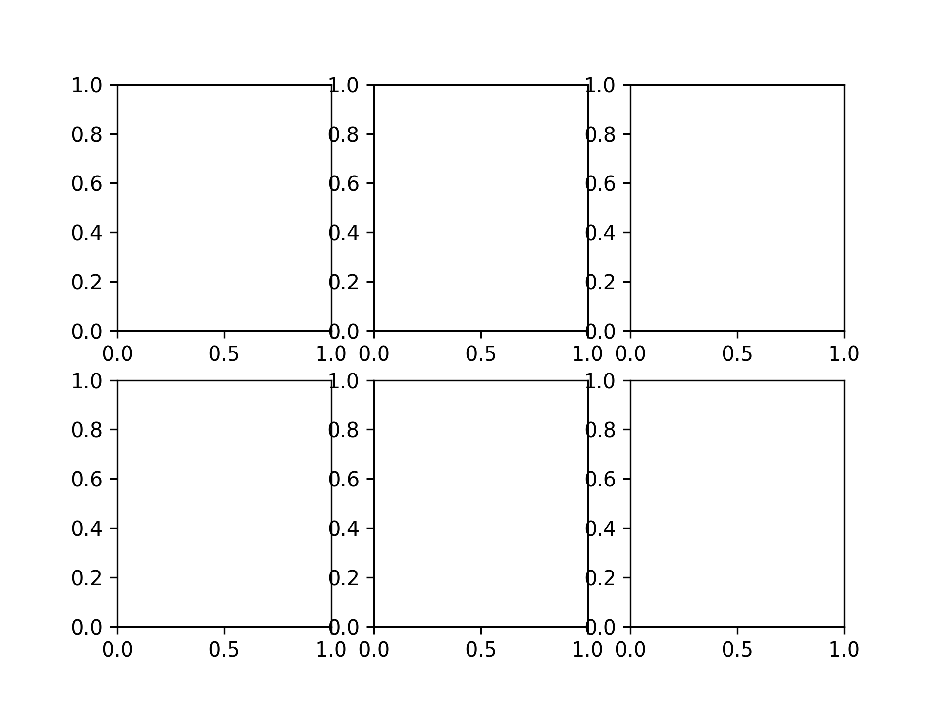
2 x 3 のグラフ
fig, axs = plt.subplots(2, 3)
グラフをプロット
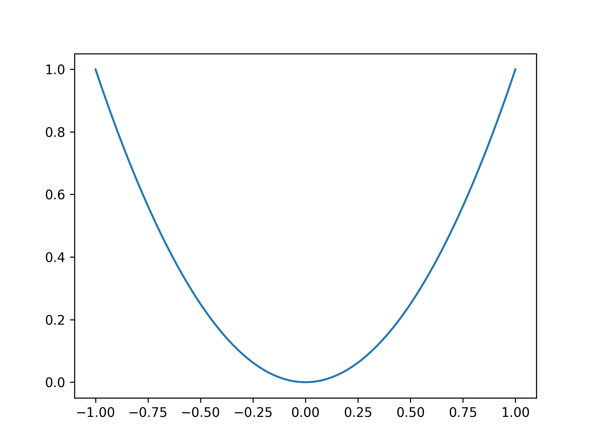
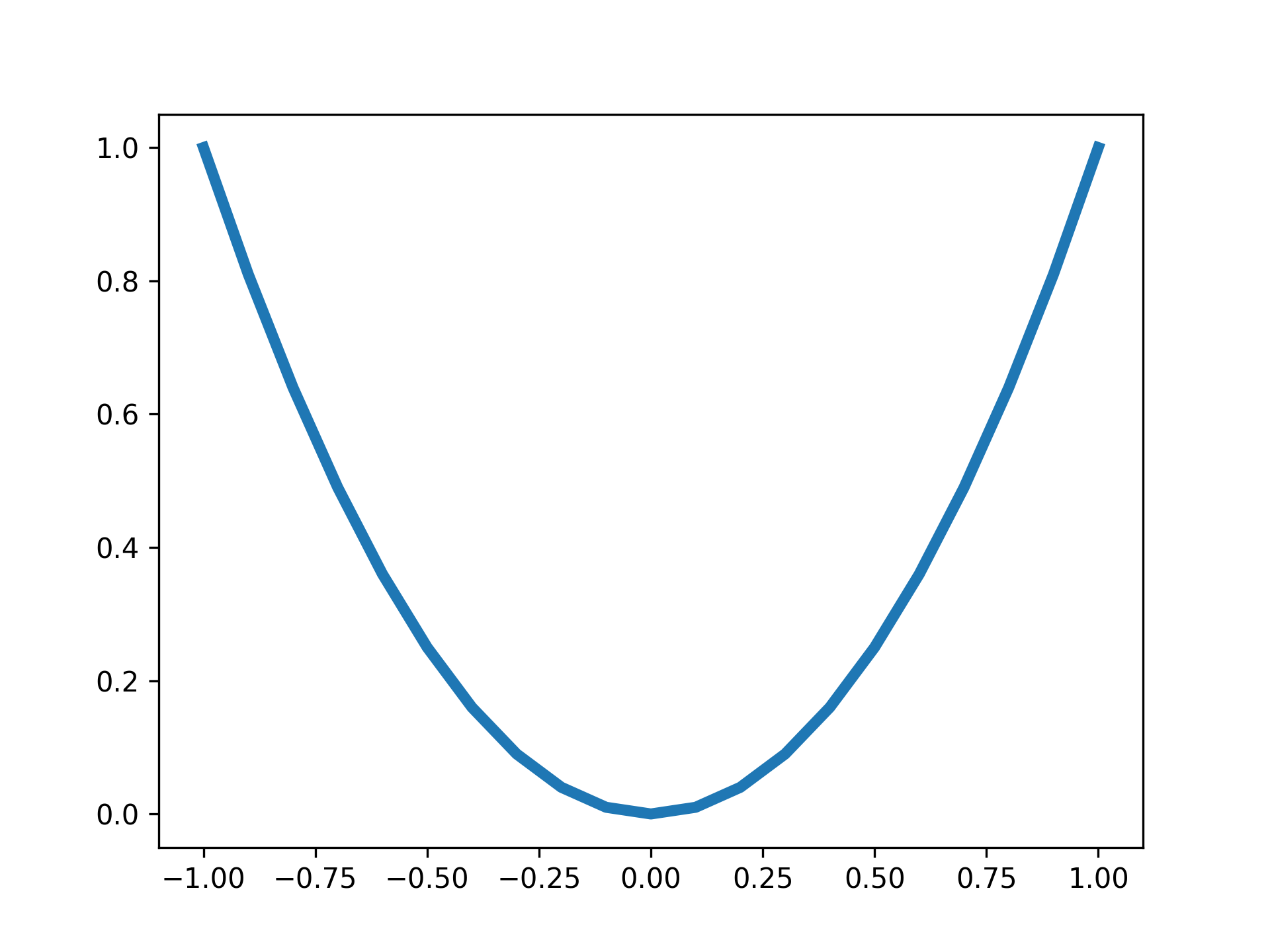
放物線のプロット
x = np.linspace(-1, 1, 201)
y = x ** 2

fig, ax = plt.subplots()
ax.plot(x, y)
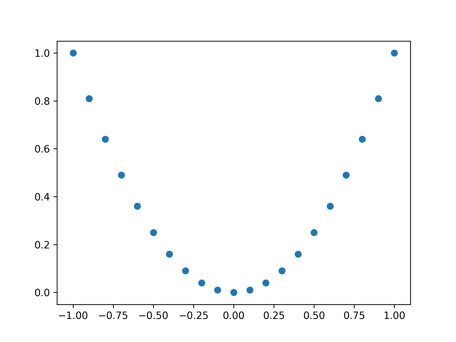
点で放物線をプロット
fig, ax = plt.subplots()

x = np.linspace(-1, 1, 21)
y = x ** 2

ax.plot(x, y, 'o')
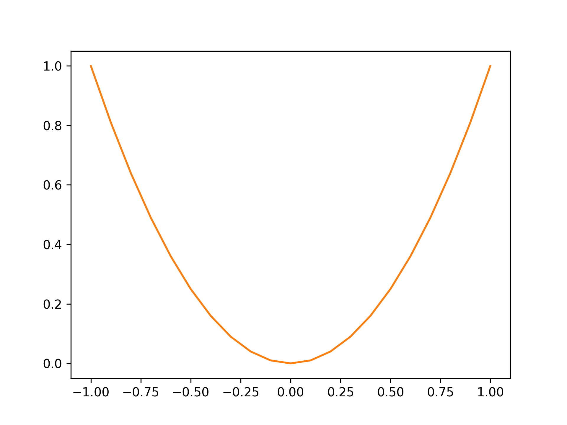
色をオレンジに
fig, ax = plt.subplots()

x = np.linspace(-1, 1, 21)
y = x ** 2

ax.plot(x, y, color="tab:orange")
標準の色は以下の通り
| 色 | 文字列 |
|---|---|
| 青 | tab:blue |
| オレンジ | tab:orange |
| 緑 | tab:green |
| 赤 | tab:red |
| 紫 | tab:purple |
| 茶 | tab:brown |
| ピンク | tab:pink |
| グレー | tab:gray |
| オリーブ | tab:olive |
| シアン | tab:cyan |
線の太さを 4 に設定
fig, ax = plt.subplots()

x = np.linspace(-1, 1, 21)
y = x ** 2

ax.plot(x, y, lw=4)
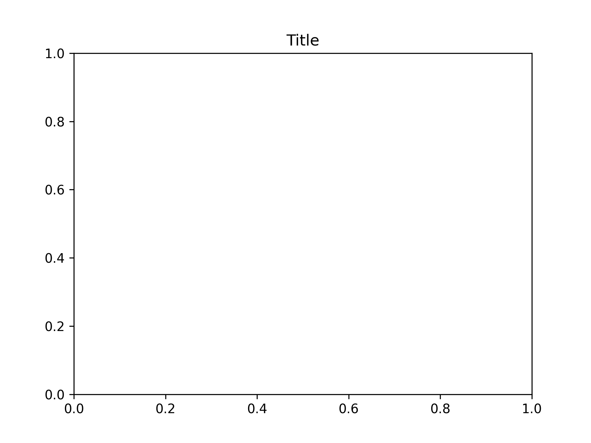
タイトルの設定
タイトルを Title に設定
fig, ax = plt.subplots()
ax.set_title("Title")
軸ラベルの設定
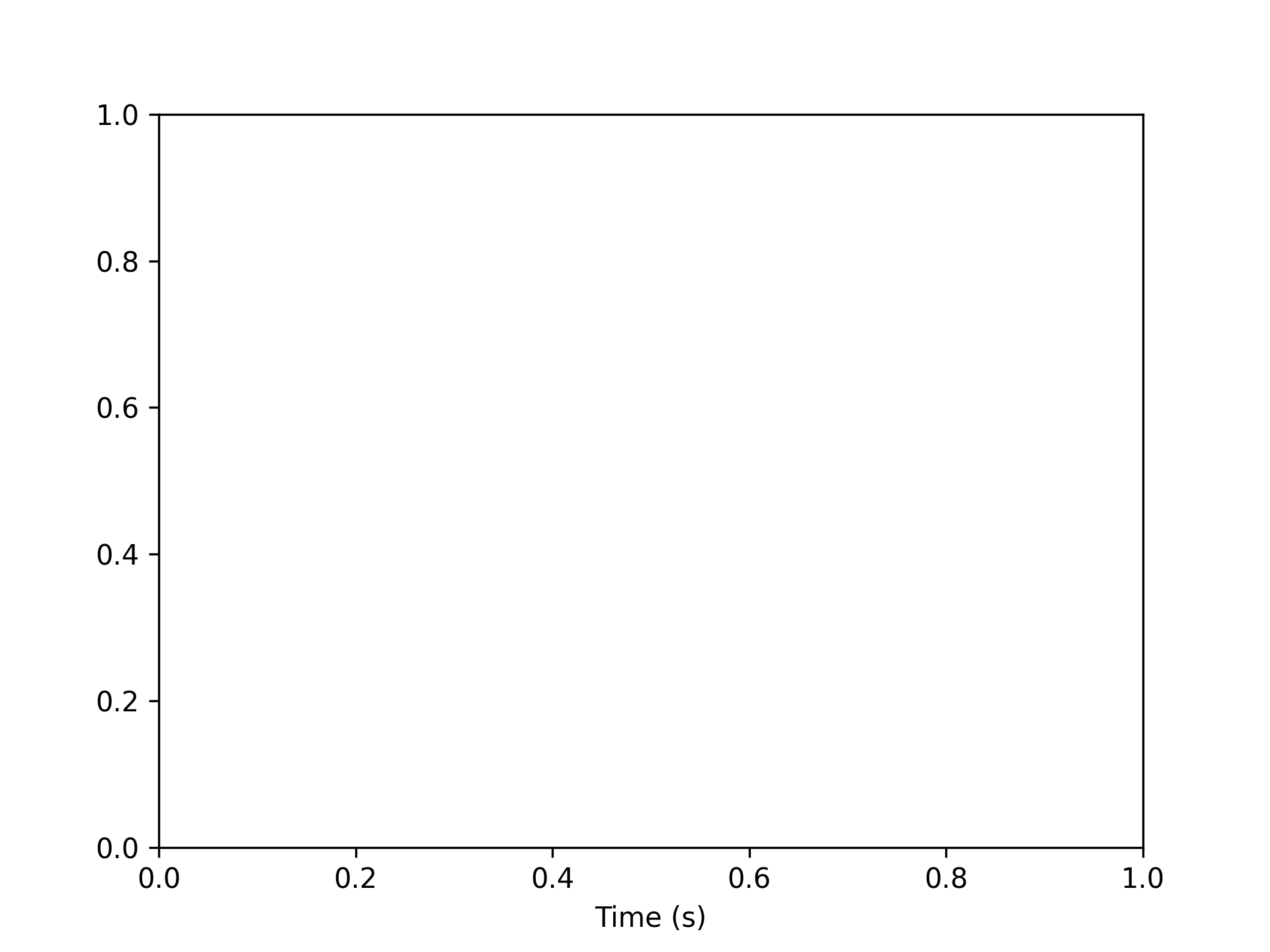
x 軸ラベルの設定
x 軸ラベルを Time (s) に設定
fig, ax = plt.subplots()
ax.set_xlabel("Time (s)")
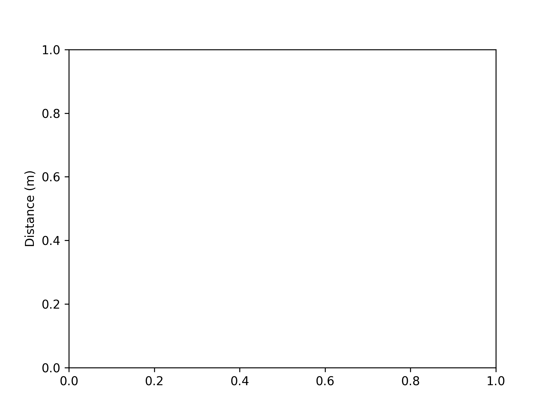
y 軸ラベルの設定
y 軸ラベルを Distance (m) に設定
fig, ax = plt.subplots()
ax.set_ylabel("Distance (m)")
グラフの上端・下端を設定
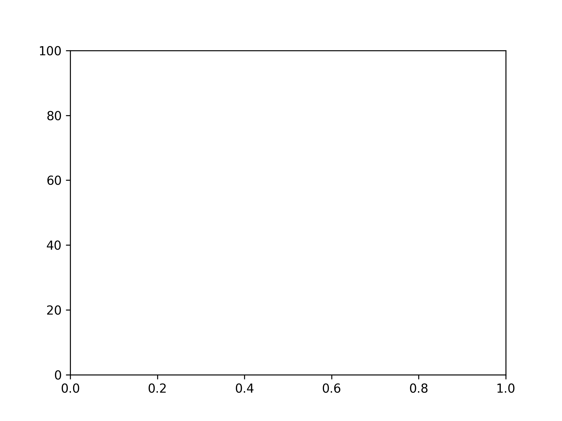
上端を 100 に設定
fig, ax = plt.subplots()
ax.set_ylim(top=100)
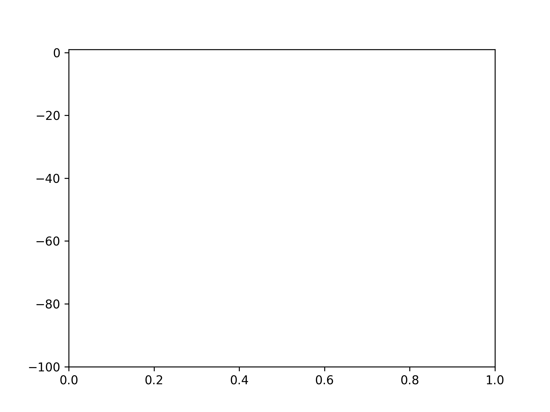
下端を -100 に設定
fig, ax = plt.subplots()
ax.set_ylim(bottom=-100)
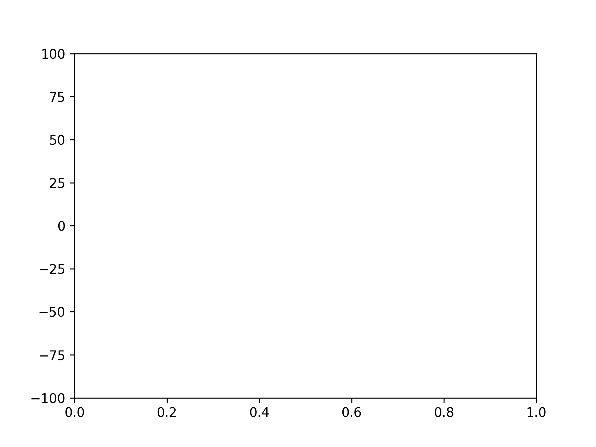
上端を 100、下端を -100 に設定
fig, ax = plt.subplots()
ax.set_ylim([-100, 100])
グラフの左端・右端を設定
左端を -100 に設定
fig, ax = plt.subplots()
ax.set_xlim(left=-100)
右端を 100 に設定
fig, ax = plt.subplots()
ax.set_xlim(right=100)
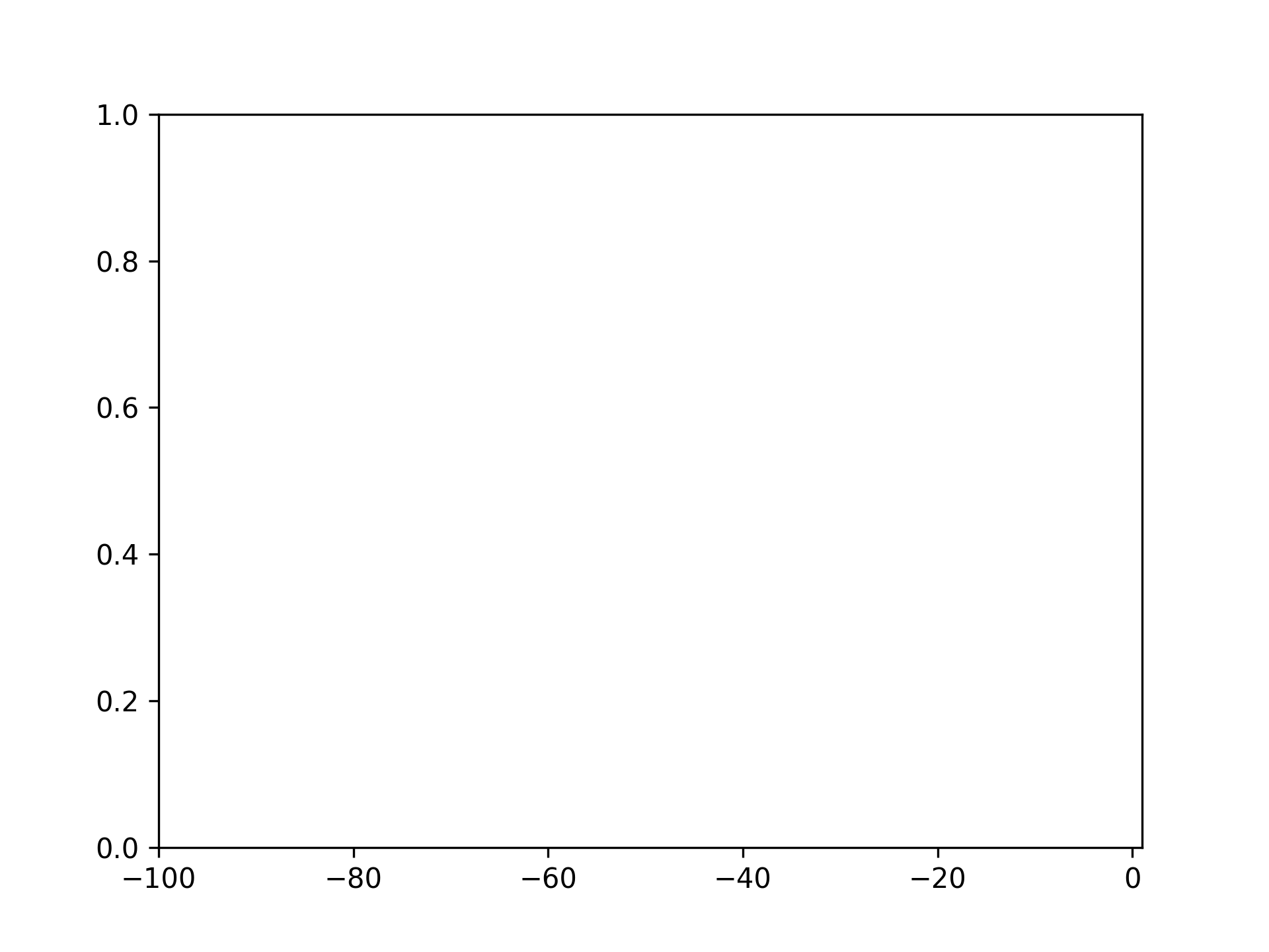
左端を -100、右端を 100 に設定
fig, ax = plt.subplots()
ax.set_xlim([-100, 100])
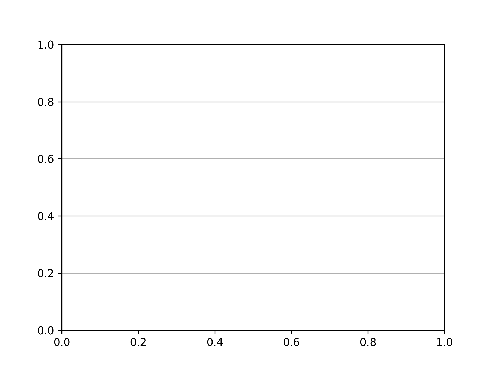
グリッドの表示
fig, ax = plt.subplots()
ax.grid()
縦のみグリッドを表示
fig, ax = plt.subplots()
ax.grid(axis="x")
横のみグリッドを表示
fig, ax = plt.subplots()
ax.grid(axis="y")
目盛りの設定
x 軸目盛りの設定
fig, ax = plt.subplots()
xticks = range(6)
ax.set_xticks(xticks)
x 軸目盛と目盛りラベルの設定
fig, ax = plt.subplots()
xticks = range(6)
ax.set_xticks(xticks, [f"{xtick}m" for xtick in xticks])

y 軸目盛りの設定
fig, ax = plt.subplots()
yticks = [i * 20 for i in range(6)]
ax.set_yticks(yticks)
y 軸目盛りと目盛りラベルの設定
fig, ax = plt.subplots()
yticks = [i * 20 for i in range(6)]
ax.set_yticks(yticks, [f"{ytick}%" for ytick in yticks])
目盛りの削除
x 軸目盛りの削除
fig, ax = plt.subplots()
ax.tick_params(bottom=False)
x 軸目盛りラベルの削除
fig, ax = plt.subplots()
ax.tick_params(labelbottom=False)
y 軸目盛の削除
fig, ax = plt.subplots()
ax.tick_params(left=False)
y 軸目盛りラベルの削除
fig, ax = plt.subplots()
ax.tick_params(labelleft=False)
目盛りの色の設定
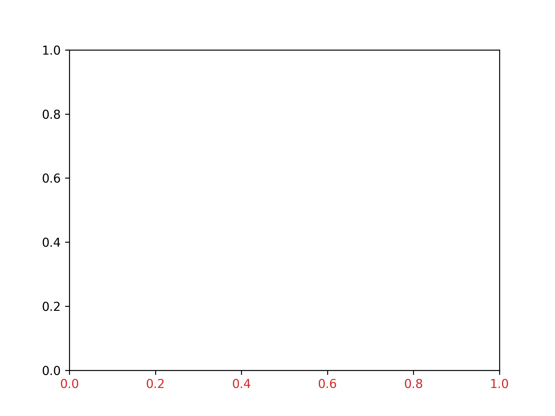
x 軸目盛りの色を赤に設定
fig, ax = plt.subplots()
ax.tick_params(axis="x", color="tab:red")

x 軸目盛りラベルの色を赤に設定
fig, ax = plt.subplots()
ax.tick_params(axis="x", labelcolor="tab:red")
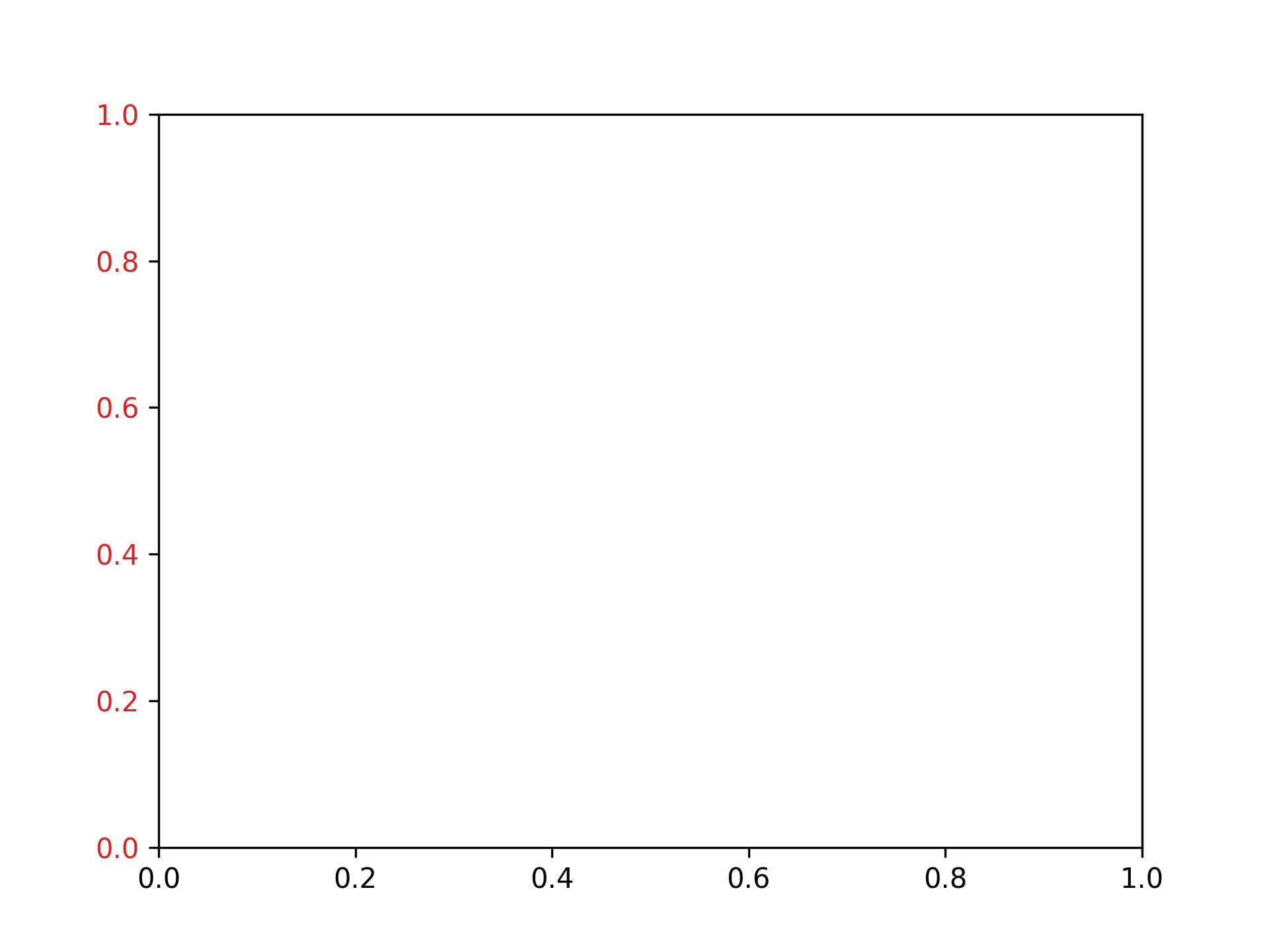
y 軸目盛りの色を赤に設定
fig, ax = plt.subplots()
ax.tick_params(axis="y", color="tab:red")

y 軸目盛りラベルの色を赤に設定
fig, ax = plt.subplots()
ax.tick_params(axis="y", labelcolor="tab:red")
グラフの間隔を調整
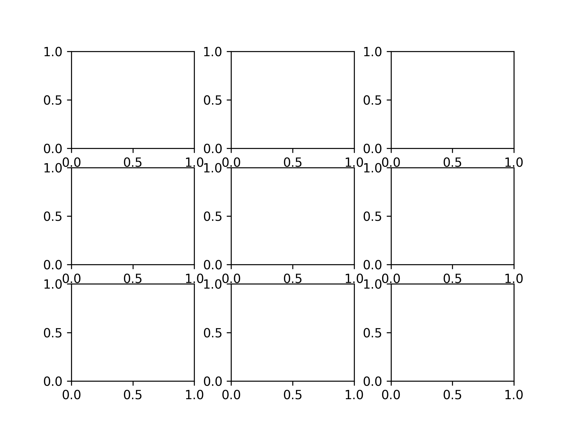
縦の感覚を 0.2、横の間隔を 0.3 に設定
fig, ax = plt.subplots(3, 3)
fig.subplots_adjust(hspace=0.2, wspace=0.3)
%Cpu22 : 0.0 us, 0.0 sy, 0.0 ni,100.0 id, 0.0 wa, 0.0 hi, 0.0 si, 0.0 st
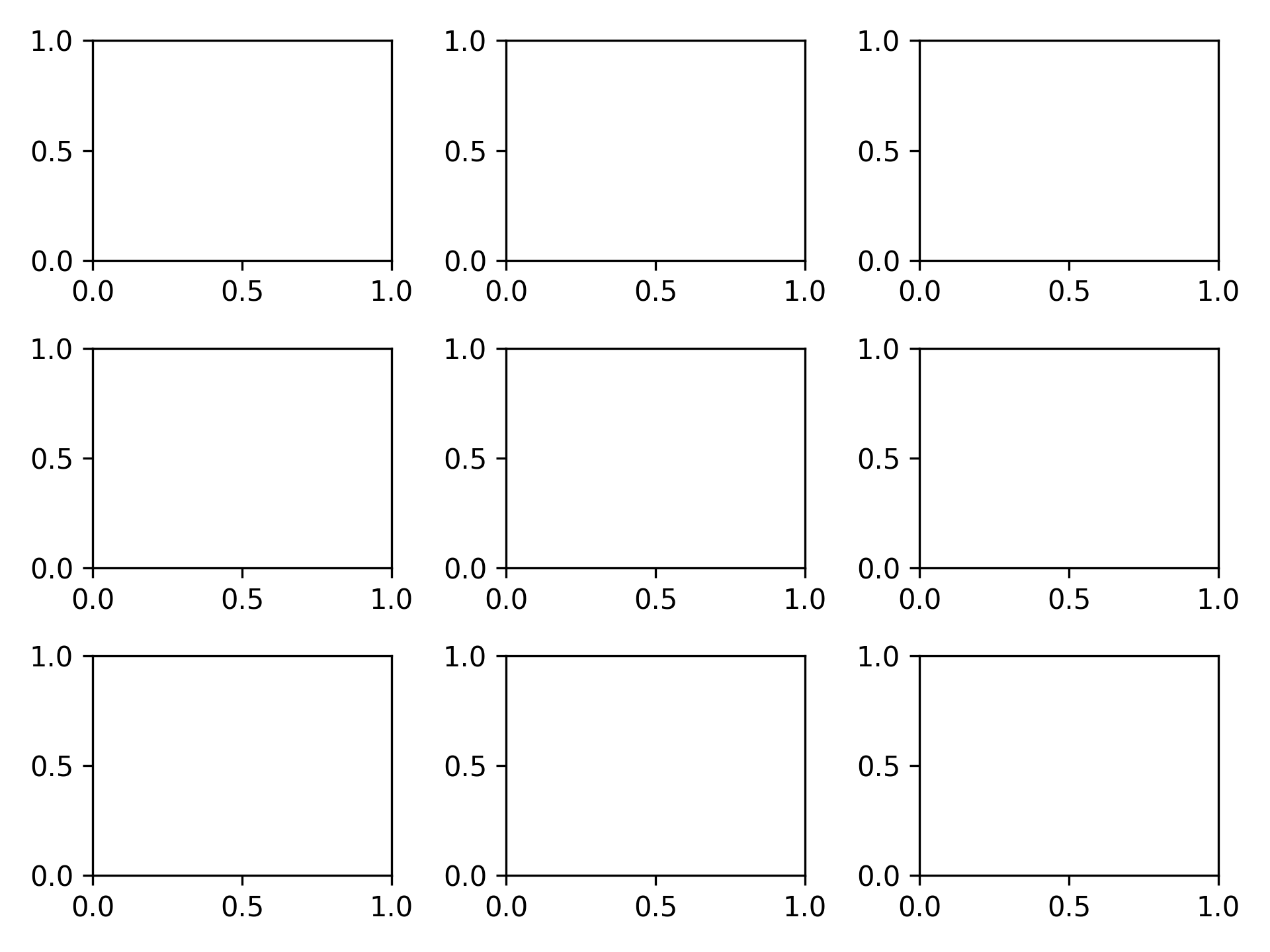
間隔を自動に設定
fig, ax = plt.subplots(3, 3)
fig.tight_layout()
画像を保存
PNG 形式で保存
fig, ax = plt.subplots()
plt.savefig("graph.png")
SVG 形式で保存
fig, ax = plt.subplots()
plt.savefig("svg.png")

PDF 形式で保存
fig, ax = plt.subplots()
plt.savefig("svg.pdf")
300 dpi で保存
fig, ax = plt.subplots()
plt.savefig("graph300.png", dpi=300)
